
Exhibition 2015
The first TypoCraftHelsinki exhibition was held in 28.8.–4.10.2015 at the Gallery Lokal Helsinki and the National Museum of Finland. Here are the participants and their works!
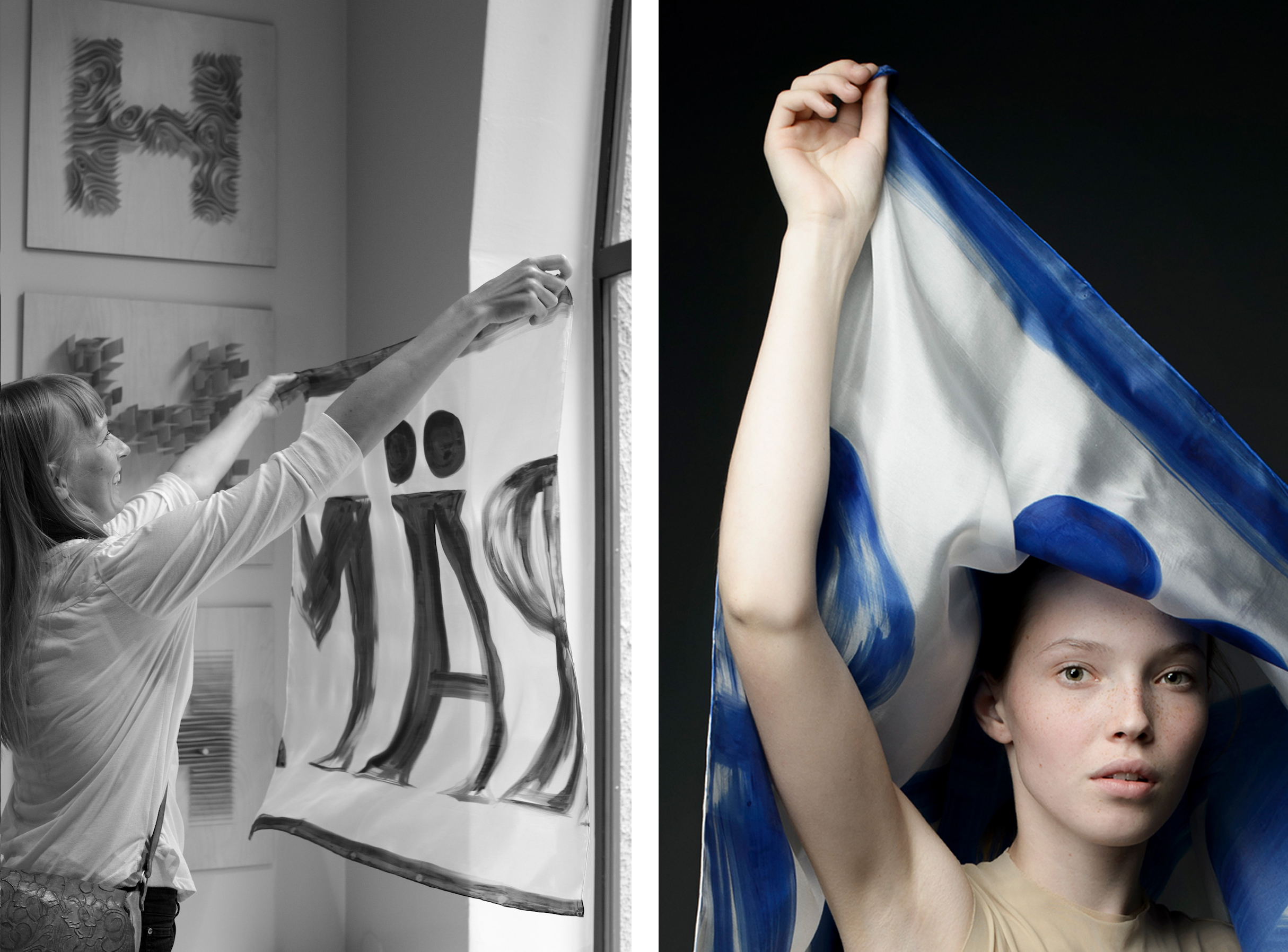
Milla Ahola
‘Typographic Helsinki on silk’
Freehand painted silk scarves exploring unique letter forms from Helsinki city scape.
× Milla Ahola is a creative, an artist and a graphic designer.

Tony Eräpuro
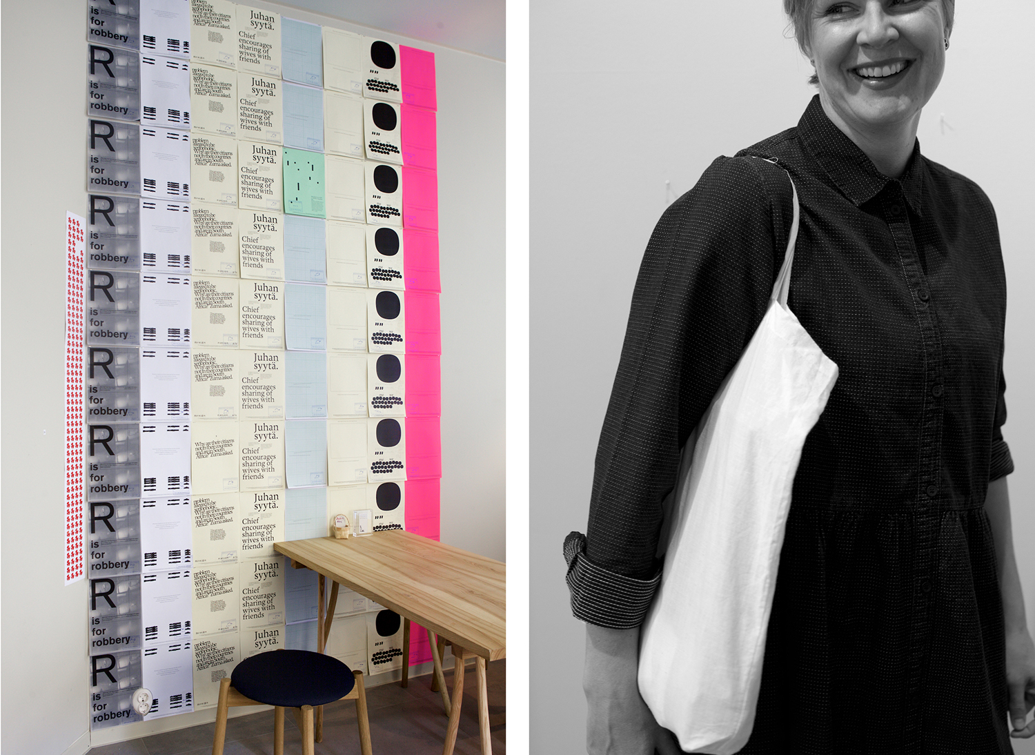
‘MA:1543’
The project is a homage to the “father of literary Finnish” Mikael Agricola (c. 1510 – 9 April 1557). Abckiria; a textbook for teaching reading skills, is Agricola’s publishing debut, and also the first book that was ever printed in what we know today as the Finnish language. It was published in 1543. MA:1543 draws inspiration from this early stage of the Finnish written language, specifically focusing on the chapters where numerals are written out as words.
× Toni Eräpuro is an art director and a graphic designer.

Jouko & Ilkka Kärkkäinen
‘H1’, ‘H2’ and ‘H3’
The works play with typography and topography of Helsinki. They depict traces of city skyline and cartographic elements in thin plywood structures.
× Jouko Kärkkäinen is a designer.
× Ilkka Kärkkäinen is a graphic designer and art director. Founding member of TypoCraftHelsinki.

Mikko Keski-Vähälä
Ceramic letters
This work takes its inspiration from old typographic knowhow. Wood letters used in printing are casted in porcelain clay.
× Mikko Keski-Vähälä is a printmaker.

Jenni Rope
‘Mobile 1’
Mobile is a slowly moving and changing installation. The spectator comes into contact with the mobile’s shapes and the refractions of shapes modified by the environment. The angle from which you look at it is constantly changing. The mobile creates a meditative space with its slow movement of shapes and shadows.
My mobile works show influence from Bruno Munari and Alexander Calder, the artists who invented mobile art in the 1930’s. Munari’s ‘Useless Machines’ mobiles (1934) respond to the principle that painting should be freed into space and transported into a temporal dimension.
× Jenni Rope is a visual artist from Helsinki. She works with many different techniques, including drawing, painting, animation, pattern design and art books.

Eeva Sivula
‘Keep Away From Fire’ dress and ‘Handle With Care’ top
Clothing product labels, originally not to be seen, become visible, decorative and playful.
‘Tiles’
Typographic collages, in the shape and size of a standard tile.
× Eeva Sivula is a graphic designer and one of the founders of Dog Design creative studio.
Outi Martikainen
‘Porkkalankatu 1’
“I’m interested in the typography people spontaneously leave behind themselves around the city. I ran into the door as I was heading to Lepakko, an underground squat in Helsinki (1979-1999). The door looked different every day. It was painted over and over again before the house was demolished. I continue that in my digital jacquard woven piece ‘Porkkalankatu 1’. A photograph of the last version of the door is the base for the weave.” The door itself now belongs to the Helsinki City Museum collection.
× Outi Martikainen is a textile artist.
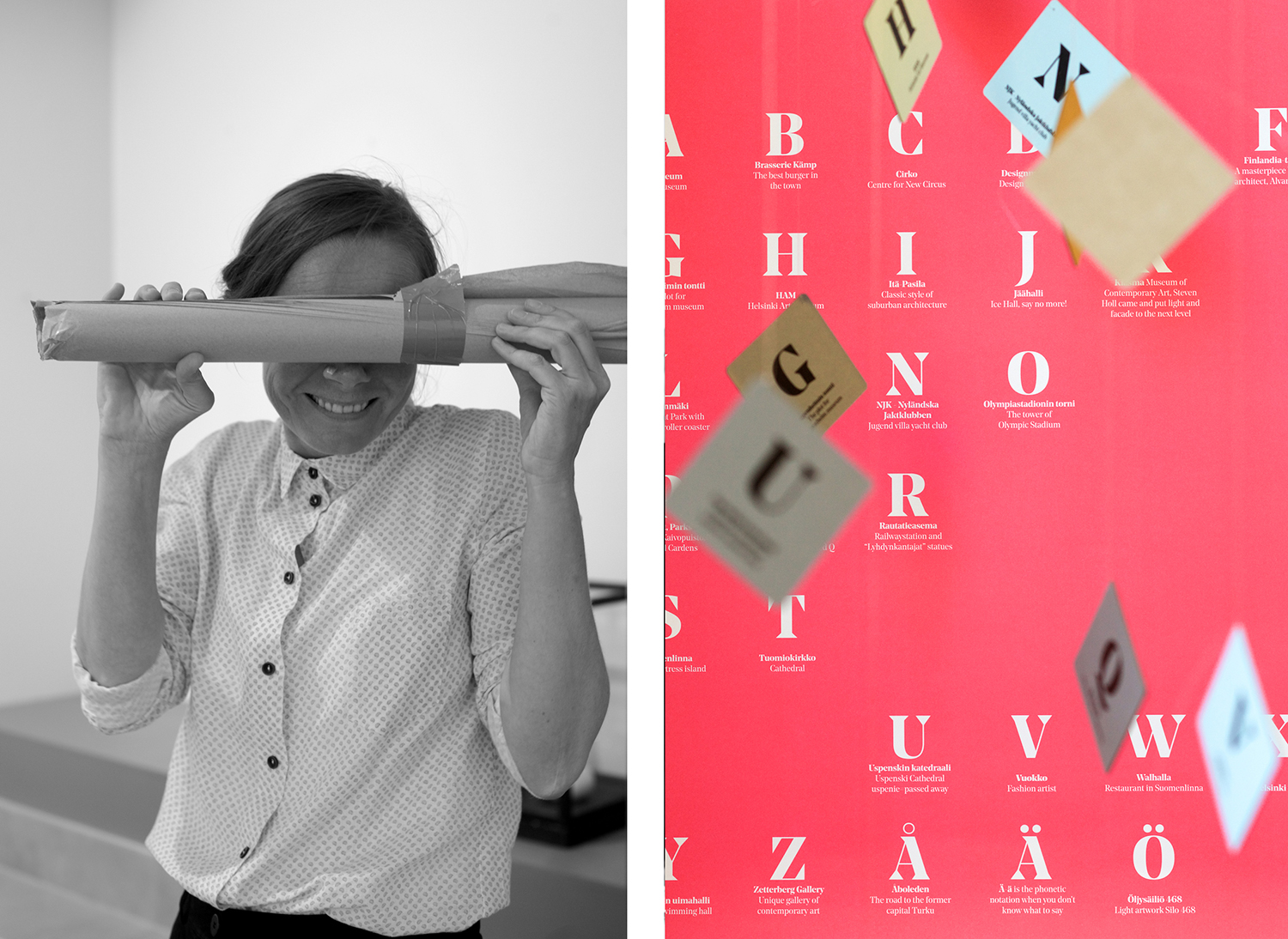
Riikka Kuukka
‘Helsinki Alphabet’
‘Helsinki Alphabet’ is a memory game which has been collected from places and things that I like in Helsinki. I am originally from the countryside, but after I got to know Helsinki I knew right away that we will make a good pair.”
× Riikka Kuukka is a graphic designer.

Kari Soinio
‘A Way by Numbers’
The series of photographs studies the basic attribute of a map, the route between two points indicated with simple codes. It is based on personal experience and observation that are used to mark and document certain routes in a city.
× Kari Soinio is an art photographer.
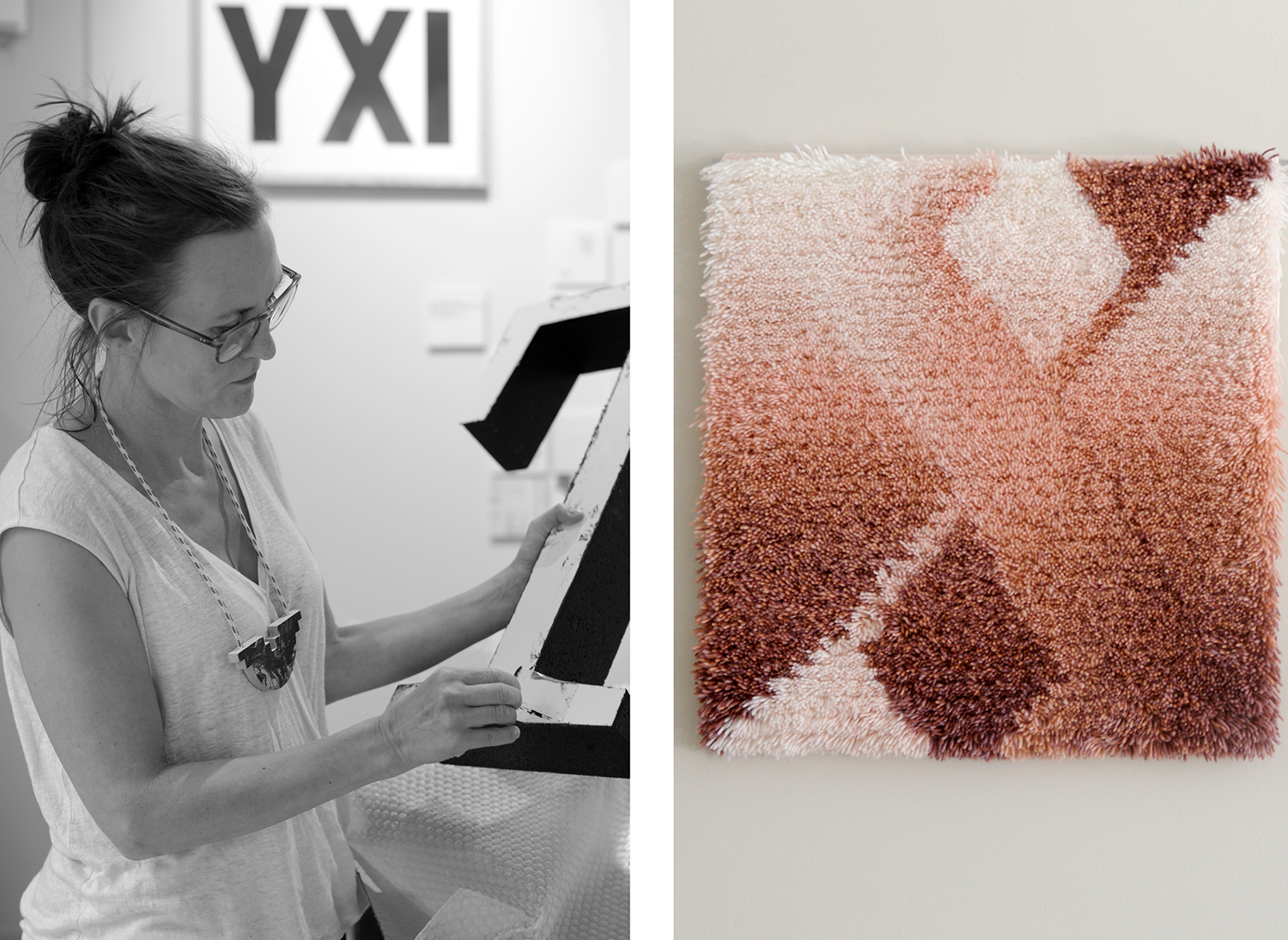
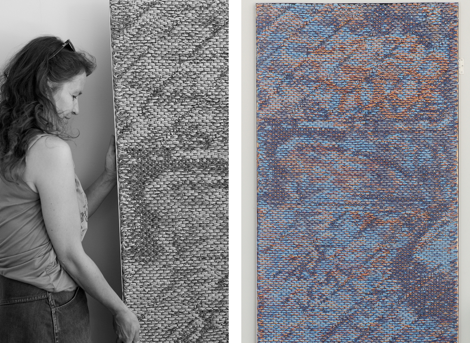
Tuija Tarkiainen
Three wall rugs
X, Ö and Ellipsis are the characters of the wall rugs. X is executed with Noe Display by Schick & Toikka and Ö with same designer’s Trio Grotesk. The selection of characters also carry some personal feelings of unknown, hesitation and waiting.
× Tuija Tarkiainen is a graphic designer. Founding member of TypoCraftHelsinki.

Laura Väinölä
‘Do your bit’
Ants are often used as a symbol for diligence. They build their hills out of single needles of fir, working together towards a common goal. Letters are small particles that are built into words. When combined correctly they form a sentence that contibutes to a greater story.
× Laura Väinölä is a creative director.

Sonja Löfgren
‘Notes – Helsinki’ and ‘Leaving’
I sow images by hand. The pictures are notes of moments and feelings, and through them I tell the viewer a self-portrait like story. The pieces in the TypoCraft exhibition were made in the midst of moving homes. As I was working on them, I was reminiscing the eight years I have spent in Helsinki and was packing all my belongings into boxes.
× Sonja Löfgren is a textile artist.

Jaakko Suomalainen
Morality, Language and Design
How I approach type design.
× Jaakko Suomalainen is an art director/type director who works mainly with graphic design, type design and curating Japanese/Finnish graphic design exhibitions.

Laura Villi
‘The Ring’
The typeface on the poster is ‘Hurme Geometric Sans No.3’ designed by Toni Hurme. The original lace is crocheted by Laura Villi’s grandmother. The poster is printed by serigraphy.
‘The Ö with Dots’
The typeface of the ceramic Ö is ‘Lounge’ designed by Jarkko Hyppönen.
Ceramic brooches
Letters U, V, T and O in two colors, lilac and black.
× Laura Villi is a graphic designer.

Nathalie Lahdenmäki
Butter, Sugar & Salt boxes
The letter S is for Sugar or Salt. ‘Voi’ is the Finnish word for butter. It also means ‘Oh’! One can find these tiny letters hidden in the ceramic boxes.
× Nathalie Lahdenmäki is a ceramic artist and a designer.

Saara Renvall
Wooden scoops
“Scoopful” gives new life to abandoned utensils. In the work, wooden scoops become actors on stage, telling stories and enacting events, turning forgotten into meaningful.
× Saara Renvall is a designer.

Timo Ripatti
‘Albrecht’
A coat stand that mimics (imitates) a letter or a letter that mimics (imitates) a coat stand.
Albrecht Dürer signed his works with a special (original) letter A which has been the inspiration for this 3 dimensionsal typographical object.
× Timo Ripatti is a product designer and architect working in his own company Studio Ripatti.
Niina Turtola
‘Ministry of Truth and Typography’
“I copy paste texts from the news in any country where I travel to, anywhere I am. Any mad news.”
× Nina Turtola is a doctoral researcher and a poster designer.

Ilona Ilottu,
Otto Karvonen
and Matti Salminen
‘Make Was Here’, schooldesk engraving workshop
Everyone who went to school probably remembers the school desk. There it stood, hour after hour, day after day, year after year. In those random moments of frustration and despair there was perhaps an irresistable urge to carve a message on the shiny surface of that bland piece of institutional furniture. When this urgent need emerged, almost anything at hand would do as a tool. A key, stone, spoon or coin – what ever would leave a mark.
× Ilona Ilottu is a graphic designer, an art director and one of the founders a Dog Design creative studio. Founding member of TypoCraftHelsinki.
× Otto Karvonen is a visual artist, specialises in temporary installations, performances and sculptures in public spaces.
× Matti Salminen is a carpenter, a woodwork teacher and a sawmill.

Tuula Pöyhönen
The series of leather letter accessories
Eralio Bianchini was a tanner in Turbigo in Northern Italy from the early 60’s until the late 80’s. Grandson Dylan inherited the abandoned tannery and called it Cinema Bianchini.
The name derives from an Italian saying; “Andare al Cinema Bianchini, sotto le coperte e sopra I cuscini”. Going to Cinema Bianchini, under the blankets and on the pillows. It’s a way of saying which means that you’re going to bed, to sleep, to dream. The saying originates from the times that going to the cinema was a privilege for the rich. Cinema Bianchini was the show the poor could afford, the free show of their own dreams.
Tuula Pöyhönen visited Cinema Bianchini and carried out the series of leather letter accessories.
× Tuula Pöyhönen is a multidisciplinary designer. Design philosophy is to follow your intuition.

Teo Tuominen
DropCap Lettering Workshop
DropCap is a lettering workshop held in Helsinki, Finland. During the workshop you will learn how to design and draw a custom lettering piece by hand. We explore the process and basic principles of designing and drawing letters, their structure, shapes and styles.
× Teo Tuominen is a letterer and a type designer.